Application Modernization Example: 5 SaaS Leaders' Case Review
March 25, 2025•16 min read

I hope you enjoy reading this post. If you want us to do your frontend development or design, click here.
Author: Alex Vasylenko | Founder of The Frontend Company


Nowadays, users have high expectations for speed, visuals, and intuitive interfaces in applications. As a business owner, you must meet these demands consistently, even if your app currently generates revenue and has many downloads or visits.
To achieve this, you need to understand that there is always room for improvement and consider application modernization as a strategy to boost conversion rates, improve retention, and scale your business.
At The Frontend Company, we specialize in application modernization services, so we've created this guide to showcase application modernization examples from leaders in the SaaS industry.
In this article, you'll discover five case studies that include before-and-after UI comparisons, the motivations behind the changes, and the business impact achieved.
Application Modernization Example #1: Salesforce – From Classic to Lightning Experience
Our first application modernization example is Salesforce - a leading cloud-based CRM platform that helps businesses manage sales, customer support, marketing, and analytics.
Before Modernization:
Salesforce's original web UI ("Classic") was functional but dated. It relied on page reloads for many interactions and had a cluttered, text-heavy layout. Navigation was top-bar oriented with minimal customization, and users often complained that the interface felt clunky by modern standards.
After Modernization:
In response, Salesforce launched "Lightning Experience," a complete UI overhaul. Lightning introduced a clean, responsive design with a left-side navigation bar, interactive dashboards, and component-based pages.
The new UI features a modern look with collapsible panels, drag-and-drop components, and dynamic updates without full reloads, making it feel more like a modern web app.
The design emphasizes accessibility of data (e.g., a visual sales path at the top of opportunity records) and is consistent across desktop and mobile.
Salesforce also introduced the Lightning Design System for a unified look and feel.
The goal behind the redesign was to make Salesforce more intuitive and help sales teams close deals faster by surfacing key information more efficiently.
Why Modernize:
By the mid-2010s, user expectations had outgrown Salesforce Classic. Customers wanted a modern, flexible, customizable, and great UI, and Salesforce's own survey found that users needed a better experience.
Competition in the CRM space (and newer SaaS entrants with slicker UIs) put pressure on Salesforce to update its look and usability. Additionally, Classic's page-refresh model was slower for users. Lightning's single-page app approach improves performance for many interactions.
Salesforce also needed a more mobile-friendly design – Lightning is fully responsive for use on phones and tablets.
Benefits and Impact of Modernization:
According to Salesforce, the new UI boosted user productivity by 41% and increased conversion rates by 44% for organizations that adopted it.
The modern UX has made it easier for sales reps to access information and update records on the fly, translating into faster deal closures and improved sales pipeline visibility. Salesforce also reports that Lightning's features (like customizable dashboards, Kanban boards for opportunities, and inline editing) help users save time and make better decisions.
The move to Lightning also positioned Salesforce as a more future-proof platform, built on a component framework that allows faster deployment of new features and integrations. By revamping a decade-old UI, Salesforce addressed user experience pain points and retained its competitive edge in the CRM market.
Still Running on Legacy UI Like Salesforce Classic?
Yes, I want to discuss how a modern interface can boost productivity and conversions
Application Modernization Example #2: Jira - From Legacy to Cloud Era
The second Saas leader in our application modernization example list is Jira - a popular project management and issue-tracking tool widely used by software development teams for agile project management, bug tracking, and workflow automation.
Before Modernization:
Atlassian's Jira had accumulated a reputation for being a powerful but unintuitive tool. The classic Jira interface featured a dense, form-like layout with top navigation menus and many options hidden deep in configurations. Longtime admins and developers could navigate it, but new users often found it overwhelming (Jira was "widely adopted but oft-criticized" by frustrated users).
By 2017, the UI was dated and inconsistent with modern web app practices. For example, configuring a board or workflow required multiple steps and sometimes custom code, and navigation between projects felt cumbersome.
After Modernization:
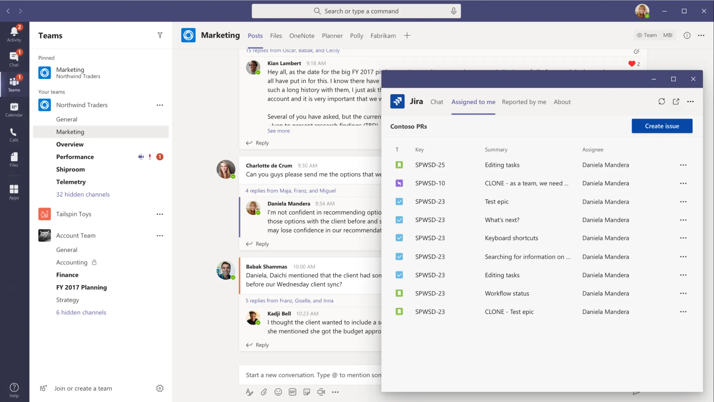
In 2018, Atlassian completed an overhaul of Jira's interface. The navigation was moved from a top menu bar to a collapsible sidebar, and the overall look became cleaner and more minimalist.
Key improvements included inline edit capabilities (e.g., editing issue fields without a separate dialog), a streamlined issue detail view, and drag-and-drop configuration of boards and workflows. Atlassian also introduced Roadmaps and a redesigned backlog to help teams plan visually.
The new UI follows Atlassian's unified design system, bringing commonality across Jira, Confluence, and other products.
Overall, the modernized Jira UX is more self-service – teams can configure their own project boards and issue types with fewer clicks and without admin assistance, a departure from the old Jira's complexity.
Why Modernize:
Atlassian recognized that software development practices had evolved, and Jira's UX needed to evolve with them. Teams adopting agile and microservices workflows found the old Jira too rigid. "Modern software teams…work differently than the teams of the past. That's why our teams reimagined [Jira] to focus on making it easier to use and more powerful for modern software teams," explained Atlassian's co-founder.
Competition was also a factor – newer rivals like Asana, Trello, and Monday.com offered simpler, cleaner interfaces for project tracking. To stay relevant for cloud-native teams, Atlassian aimed to reduce Jira's learning curve and administration burden.
In short, the company chose to modernize due to user experience issues (complexity, dated UI) and the need to support new ways of working while leveraging cloud scalability.
Benefits and Impact of Modernization:
The Jira redesign yielded significant benefits. User feedback noted that the new interface is much cleaner and more intuitive, helping teams onboard faster. Tasks that used to require expert admins (like adding a new issue field or changing a workflow) can now be done with a few clicks, empowering end-users and reducing support load.
This improved usability has been critical as Atlassian transitioned many customers from server versions to Jira Cloud. The modernization helped drive cloud adoption: Atlassian's Jira user base continued to grow (reaching tens of millions of users), and its monthly active users have increased, thanks in part to a more engaging UI.
From a technical perspective, the new React-based frontend and design system also reduced inconsistency across Atlassian's product suite, reinforcing their brand and making it easier for users to adopt multiple Atlassian tools.
In sum, Jira's modernization addressed usability complaints and positioned the product for the cloud era, helping Atlassian fend off competition and keep its large customer base productive.

Transform your UI for peak performance!
🔹
Unlock seamless, high-performance frontend solutions tailored to your business.
🔹
Get an interface that outshines competitors and delights your users.
Application Modernization Example #3: FreshBooks – Rebuilding for Simplicity and Speed
The next application modernization example is FreshBooks - a cloud-based accounting software designed for small businesses, freelancers, and self-employed professionals.
Before Modernization
FreshBooks launched in 2004 with a focus on invoicing. Over more than a decade, the product grew in features, but its UI became dated and unwieldy. The Classic FreshBooks interface used a top navigation bar (tabs for Invoices, Expenses, Reports, etc.) with a straightforward but aging design.
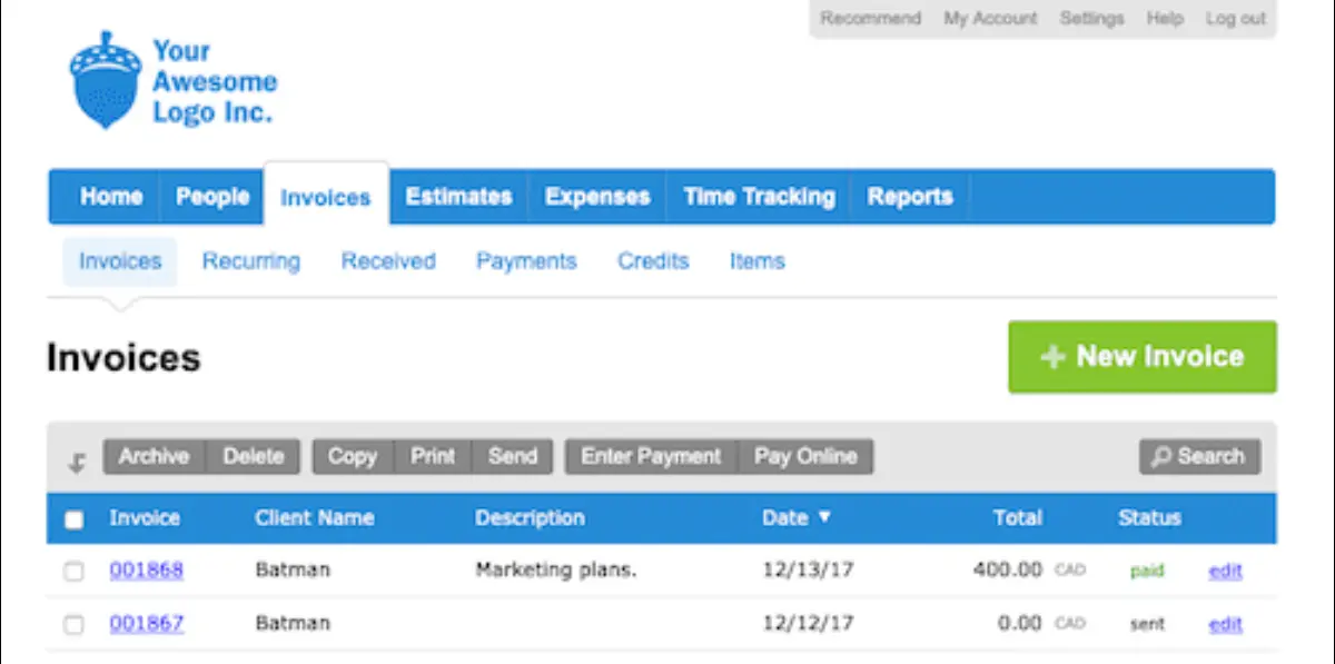
While longtime users found it simple, new users faced some friction as more features were bolted on. By 2015, FreshBooks Classic had "grown organically over 10 years and had become kind of unwieldy…for new users, learning to use it was daunting," admitted FreshBooks' product design manager. The backend was a PHP-based web app with relatively slow update cycles.
Competitors like QuickBooks Online and Xero were offering more modern, slick interfaces, raising the stakes.
After Modernization:
In 2016, FreshBooks undertook a bold move – they rebuilt their platform from scratch and launched what they called the "All-New FreshBooks." This wasn't just a reskin. It was a ground-up rewrite of both frontend and backend.
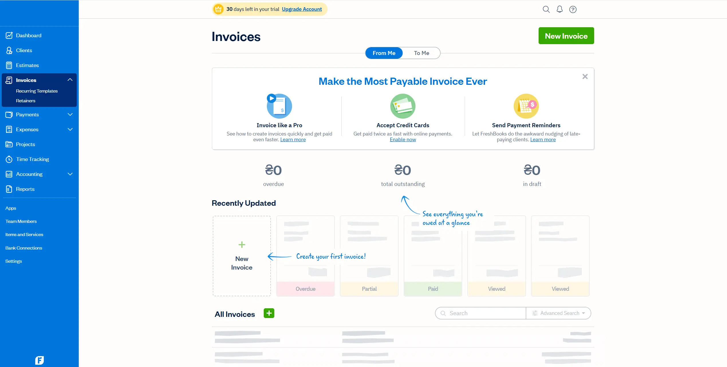
The new FreshBooks UI featured a bright, visually engaging design with a left-side navigation menu (Dashboard, Clients, Invoices, Expenses, etc.), big bold buttons, and an overall simplified workflow. The dashboard was completely redesigned to give users a quick snapshot of their business health (e.g., invoice status, total profit) at a glance.
Invoices and expenses screens were made more form-like and easier to fill out, with inline editing and contextual help. FreshBooks also added new capabilities (like a Project collaboration feature and multi-currency support) in this revamp.
Notably, the technology stack changed – FreshBooks moved from a PHP monolith to a modern JavaScript single-page application (built on Ember.js for the client side)
This made the web app feel much more responsive and "app-like" in behavior, similar to a native app on a tablet or phone.
Why Modernize:
FreshBooks' leadership recognized that to stay ahead in the accounting software market, they needed more than incremental tweaks – the application needed to be reimagined for the next decade. CEO Mike McDerment wrote an open letter to users, noting the new FreshBooks is "not just a visual redesign, but a whole new product," rebuilt to solve the same problems "in simpler and more modern ways.".
The company set an internal goal to make the software 10× easier to use than before.
The old UI, while functional, started to feel clunky to newer, less tech-savvy business owners. FreshBooks's target users (freelancers, self-employed professionals) needed an interface "ridiculously easy to use" without accounting jargon.
By the mid-2010s, QuickBooks Online, Xero, and others had sleeker cloud offerings. FreshBooks feared losing customers if it didn't innovate.
Additionally, FreshBooks saw the rise of the gig economy – they cited that by 2020, 40% of the U.S. workforce would be self-employed. They modernized to serve these users with features like mobile apps and more automation.
Benefits and Impact of Modernization:
The "New FreshBooks" launch was transformative. FreshBooks invested an estimated $7 million in this redesign initiative, and it was expected to help drive roughly $50 million in additional revenue.
The revamped UI/UX received praise for making bookkeeping tasks even faster: tasks like creating invoices and tracking expenses were reduced from taking minutes to seconds. In one review, a user noted FreshBooks cut invoice processing time from ~30 minutes to ~5 minutes per client, thanks to the streamlined workflow.
This kind of efficiency improvement is critical for busy freelancers and translates into strong customer satisfaction. The redesign also boosted FreshBooks' market positioning – it reinforced their brand as "easy-to-use" accounting software (their core promise).
In fact, the CEO described the new FreshBooks as "the most ridiculously easy to use accounting software ever built – yet still packed with powerful features."
FreshBooks noted that users were making use of the new dashboard and reports more frequently than in the past, indicating better insight into their finances.
📖 Read More: 5 Best Application Modernization Companies in 2025
Application Modernization Example #4: Evernote – Cross-Platform Redesign
#4 is Evernote, which is a perfect application modernization example when you need better performance, reduced technical debt, and to position yourself for future growth.
Before Modernization:
Evernote, a popular note app, spent years with relatively minimal UI changes. Its legacy applications on Windows, Mac, and mobile had diverging designs and codebases, leading to inconsistent UX.
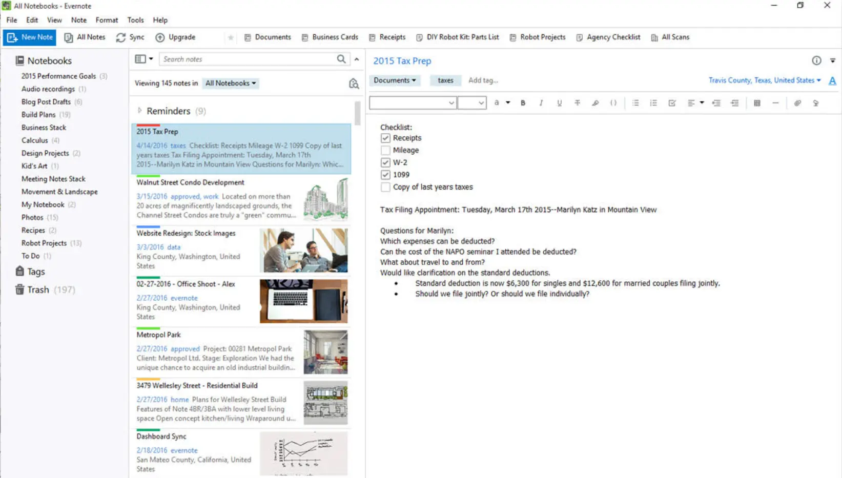
By the late 2010s, Evernote's software had stagnated – features were hard to implement across platforms, and performance was lagging (notes could be slow to load). The interface started to feel outdated compared to newer productivity apps. For example, Evernote's Windows client had a busy three-pane layout (notebook list, note list, note editor) with a lot of Chrome and small icons.
Users loved Evernote's core idea but complained about the app's lag and occasional bloat. The company also faced intense competition from OneNote, Google Keep, and startups like Notion.
It became clear that a major overhaul was needed to "reclaim its crown" among note-taking apps.
After Modernization:
In 2020, Evernote began rolling out a major cross-platform redesign (often referred to as Evernote "v10"). Rather than tweaking one platform at a time, Evernote built a unified new codebase for all clients. They adopted modern frameworks (Electron for desktop, Swift for iOS, Kotlin for Android, with a common React-based UI layer) so that features and design would be consistent.
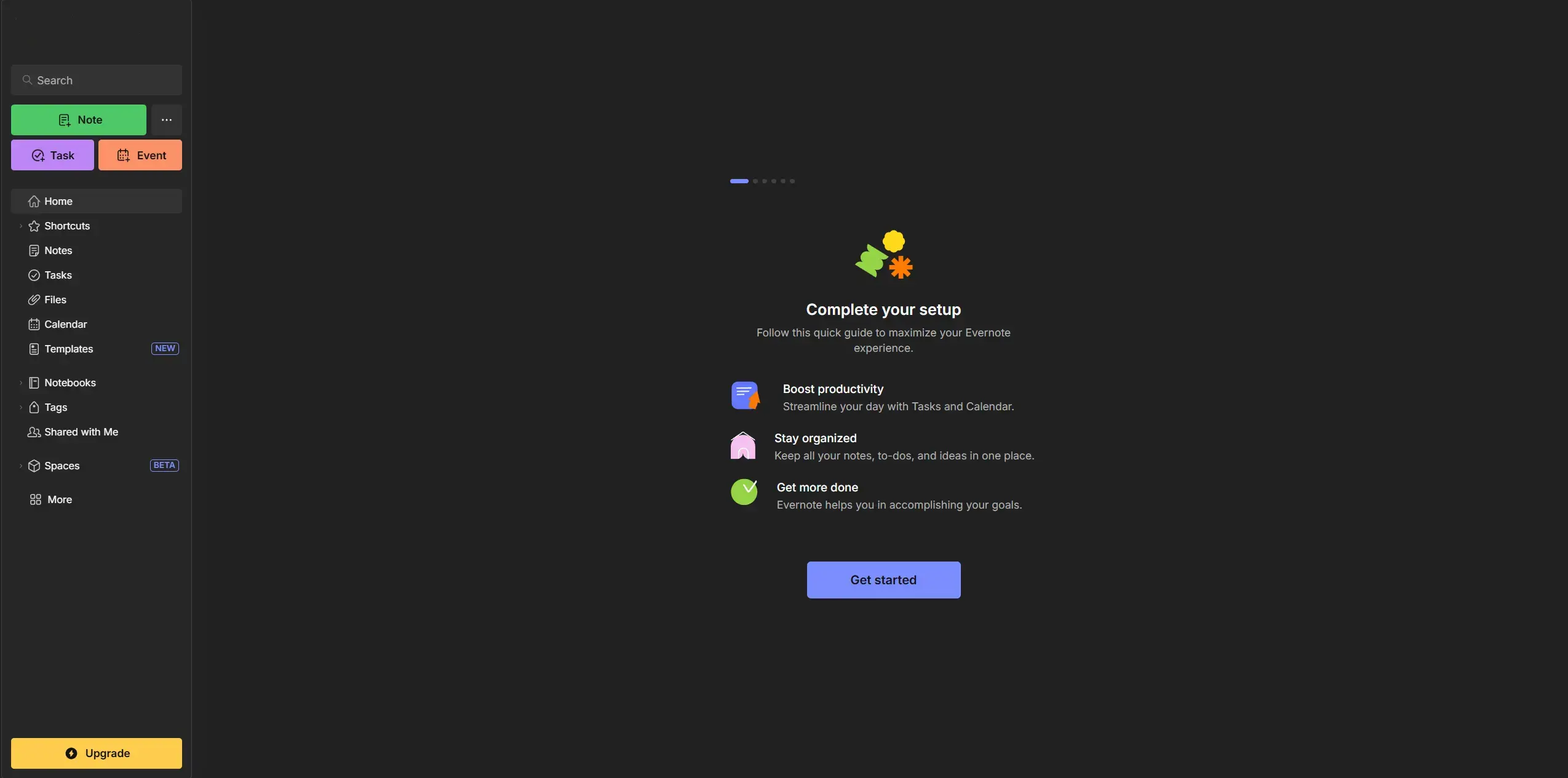
The new Evernote UI has a cleaner, more minimalist look. For example, there's a Home dashboard that gives users a high-level overview (with note shortcuts, recently captured content, and more). They also introduced improved search with filters and a redesigned editor with better formatting options. The color scheme and typography were updated for a fresher, lighter feel.
While the overall structure (notes organized in notebooks with tags) remained, nearly every visual element was refreshed to be more modern and touch-friendly.
Under the hood, Evernote built a new syncing engine and revamped how notes are stored locally to boost speed and reliability.
Why Modernize:
Evernote's decision to modernize was a matter of survival. By their own admission, the app had suffered "years of stagnation" and risked irrelevance.
Competing apps were innovating with real-time collaboration, sleek UIs, and AI features, while Evernote's UX was stuck in an earlier era.
Moreover, the company was receiving feedback from longtime customers that the product felt slow and clunky.
Also, Evernote had separate codebases for Windows, Mac, iOS, Android, and Web – five different versions that were hard to keep in feature parity. The modernization aimed to unify the platform so Evernote could deliver improvements across all devices faster.
Additionally, apps like Notion were providing integrated, sleek experiences on the web and desktop. To appeal to a newer generation of users and win back dissatisfied ones, Evernote needed a modern UX and the ability to iterate quickly (e.g., adding dark mode, AI search).
The CEO, Ian Small, basically positioned the redesign as building a foundation for the next decade of Evernote, enabling features that were impossible on the old architecture.
Benefits and Impact of Modernization:
The transition was challenging, but ultimately gave Evernote a new lease of life. Within the first year, the benefits of the new platform began to show. By 2021, Evernote had fixed many long-standing performance issues – for example, the new sync engine made syncing up to 3× faster, and the app launch times on desktop and mobile dramatically improved.
Users noticed that editing notes and switching between notes were more instantaneous than before. The unified codebase meant Evernote could finally deliver features in parallel: they rolled out a Tasks feature, a Calendar integration, and an AI search across all platforms in short succession.
This accelerated cadence helped re-engage users and garnered positive press that Evernote was innovating again.
An Engadget analysis in 2020 noted that "after years of stagnation, [Evernote] appears ready for a comeback" with its cross-platform redesign.
While Evernote didn't publicly release usage figures, the modernization was aimed at stabilizing its user base and reducing churn. Indeed, by addressing major pain points (like slow sync and inconsistent UX), Evernote likely improved its user retention and customer sentiment.
📖 Read More: Application Modernization Roadmap: A Step-by-Step Guide for Creation
Application Modernization Example #5: Microsoft Teams - Smarter, Faster Experience
The last application modernization example in our list is Microsoft Teams - a collaboration and communication platform that integrates chat, video conferencing, file sharing, and project management into one workspace.
Before Modernization:
The original Teams application was built on Electron with AngularJS, and as features piled on (chat, meetings, files, and apps integration), many users experienced slow load times and high memory usage.
The UI was functional but had minor UX pain points: e.g., switching between chats and channels could feel laggy, notifications were sometimes delayed, and there was much white space that wasn't customizable.
By 2022, with 270+ million monthly users, feedback from enterprises was that Teams needed to be faster and more streamlined. Microsoft also faced pressure from competitors like Zoom and Slack, which were perceived as more nimble.
After Modernization:
In 2023, Microsoft announced a reimagined Teams client, rebuilt "from the ground up" with a performance-first mindset. The new Teams (initially released in Public Preview) looks very similar in terms of layout, but under the hood, it's a completely new application.
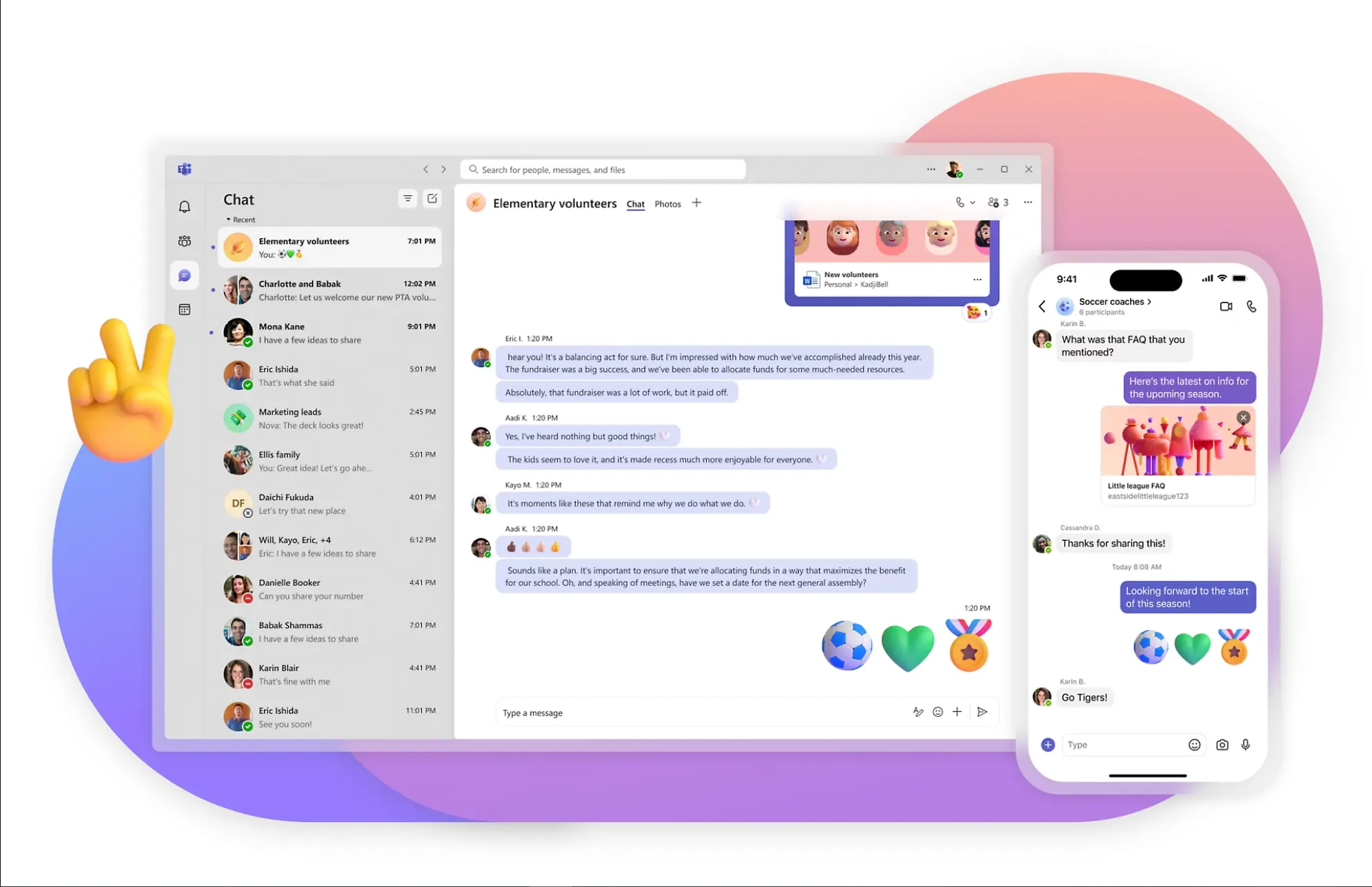
Microsoft reduced complexity in the interface by simplifying workflows – for instance, managing notifications and organizing channels have been made easier with fewer clicks.
The real star is performance: the new Teams loads dramatically faster and runs more efficiently. Microsoft highlighted that joining a meeting is now 2× faster and switching between chats/channels is 1.7× faster than before
Memory footprint was cut by 50%, and the app installer size was reduced significantly. This means users, especially those on older hardware, notice Teams launching quickly and not bogging down their system as the old client did.
Additionally, the new Teams client is "AI-ready," optimized to integrate new features like Microsoft 365 Copilot (AI assistant) without further performance hits.
Why Modernize:
The push to modernize Teams was driven by both user experience concerns and strategic goals. First, user feedback had long flagged performance as a major issue – in corporate environments where Teams is open all day, a slow, memory-hogging app frustrates users and impacts productivity.
Microsoft knew they had to drastically improve UX responsiveness to maintain user satisfaction in the face of Slack, which was perceived as lighter-weight. Second, Microsoft saw an opportunity to simplify the codebase and align it with modern web technologies. The original Teams' tech stack (Electron + AngularJS) was showing its age. By moving to Edge WebView2 and React, Teams could leverage a more efficient rendering engine and web framework.
Third, Microsoft wanted Teams to be a platform for the future (with AI and extensibility), which required a more flexible architecture. The new "North Star" architecture was devised to remove past limitations and make adding features easier.
Finally, competition and pandemic-driven usage made performance a top differentiator, with so many relying on Teams for remote work, any lag or glitch was magnified. Improving speed and usability directly ties to user engagement. If Teams is fast and pleasant, companies won't seek alternatives.
Benefits and Impact of Modernization:
For end-users and organizations, the productivity gains are clear: less time waiting for meetings to connect or chats to load means more time getting work done. A GigaOm benchmark study confirmed that the new Teams achieves 2× overall better performance over the legacy client.
Microsoft reported Teams had reached 280 million MAU (Monthly Active Users) by early 2023, and maintaining such a large user base requires keeping satisfaction high – the redesign is a direct response to ensure those users remain active and don't drop off due to poor UX.
For Microsoft's business, a faster Teams strengthens its competitive position in the collaboration market and adds value to the Office 365 suite. Moreover, the new architecture enables Microsoft to roll out new capabilities faster. For example, after the rebuild, Microsoft was quickly able to integrate AI features (like Copilot) and introduce a multi-tenant capability (users can more easily toggle between different accounts/organizations in Teams).
Another benefit is that the 50% reduction in memory usage makes Teams viable on a wider range of devices, potentially expanding the user base. Internally, Microsoft's engineering teams can now maintain a single robust codebase rather than juggling legacy frameworks, which lowers development costs long-term.
In summary, by modernizing Teams' UI/UX and under-the-hood architecture, Microsoft achieved a more competitive, user-friendly product, which translates into tangible business advantages in user growth and satisfaction and sets the stage for future innovations in the platform.
Modernization Benefits Table
Company | Modernization Outcome |
|---|---|
Salesforce | 41% increase in productivity, 44% higher conversion rates, and better user experience across devices. |
Jira | Simplified setup, reduced admin dependency, faster onboarding, and growth in cloud user base. |
FreshBooks | Estimated $50M revenue boost, invoice time reduced from 30 to 5 mins, increased customer satisfaction. |
Evernote | 3× faster sync, unified experience across platforms, faster feature delivery, and regained user trust. |
Microsoft Teams | 2× faster meeting joins, 50% less memory usage, better UX on all devices, and AI feature readiness. |
📖 Read More: 5 Application Modernization Challenges No One Talks About
Conclusion
These application modernization examples highlight an undeniable truth: every business must stay ahead of trends, adapt to change, and realistically assess its position in the market. If your application or interface feels outdated and frustrates users, you risk losing them.
Even if you're a large company with a loyal customer base, a fresh startup can disrupt your market position, offering a faster, more intuitive, and feature-rich product.
Today, usability, speed, and simplicity are not just advantages — they are essential for survival. The urgency of modernization will only grow over time, and even small improvements can yield significant results, helping you stay competitive and mitigate risks.
To successfully modernize your application, you need a trusted partner with experience in delivering high-impact transformations. That's where The Frontend Company comes in. We specialize in application modernization services, UI/UX redesigns, and frontend development that help SaaS businesses stay ahead.
💡 Contact us for a free consultation, where we will assess your current product state and provide a list of recommendations that can improve your SaaS platform or web application immediately.
Unlock the full potential of your product

Boost customer retention & satisfaction
Become more competitive on the market
Move to the latest technologies stacks
Improve usability & visual appeal
FAQ


Alex Vasylenko is the founder of The Frontend Company, DBC and several other successful startups. A dynamic tech entrepreneur, he began his career as a frontend developer at Deloitte and Scandinavia's largest banking company. In 2023, Alex was honored as one of 'Top 10 Emerging Entrepreneurs' by USA Today.
RATE
Rate this article please
This will help us provide more useful information.
592 ratings, average 4.98 out of 5